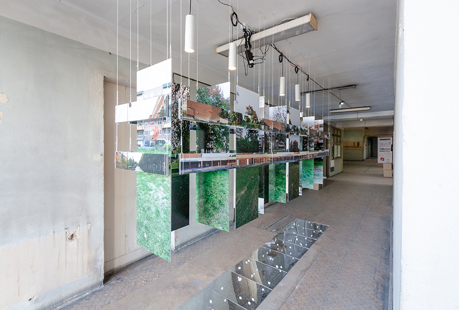
THIS SPACE BETWEEN US
INSTALLATION AT THE
TBILISI ARCHITECTURE BIENNIAL
IN TBILISI, GEORGIA, 2018
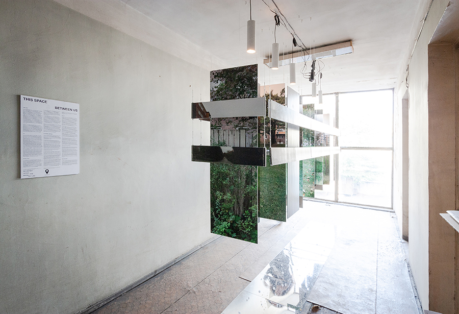
IMAGE MACHINES
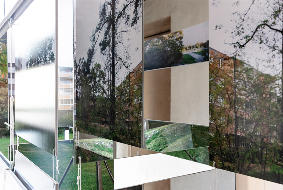
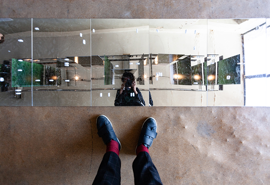
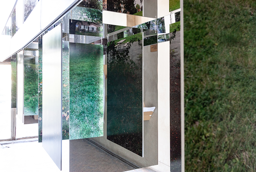
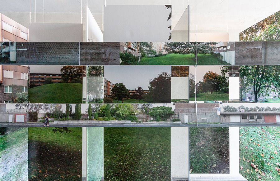
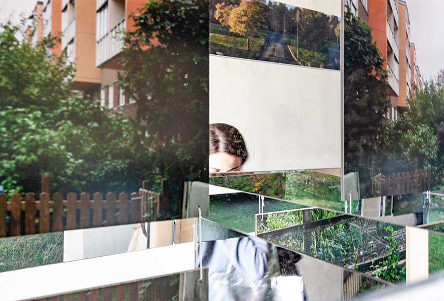
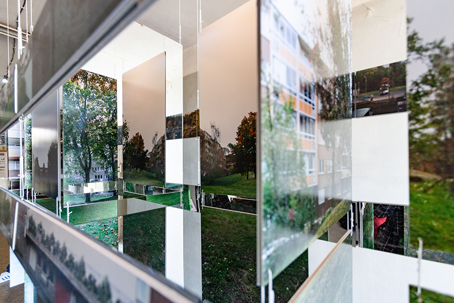
Through This Space Between Us, Secretary attempts a formal engagement with modernism, by way of the precise framing of a diffuse modern dream in architectural terms. Through this installation, we test an architectural gaze that admits that its lens is fractured and that its performances are implausible at the best of times, but that sees value in the porous plinth of Fisksätra, with its rough concrete walls below and garden courtyards above.
This Space Between Us was produced, with the support of the Center for the Future of Places at KTH in Stockholm and of IASPIS-Konstnärsnämnden, for the Tbilisi Architectural Biennial 2018.
GAME FACE
A figure stands at the edge of a concrete walkway, looking out. You are this figure. You stare at the edge of the strip of forest, eyes a little unfocused after a day at the office, imagining the distant water, the yacht club, and the sports fields, beyond the parking lots below. It is 1979, and the residential neighborhood of Fisksätra is five years old. Beneath you, a field of shiny objects—cars, garbage trucks, a train—go about the business of ferrying people and goods around. You can’t see from here the point where the cars enter the garage (it’s located beneath where you are standing); but you know that the garages are there, filled with sleeping automobiles, a place you encounter on weekends, when you decide to retrieve your own car to take a drive in the countryside. To get to work, you take the train. Crossing the sea of parking on a narrow bridge every morning, you savor your elevation until the last possible moment, until the flow of commuters drags you down the stairs and onto the platform and onto the train and out towards to the central city. Up here, on the edge of the wall, looking out, you are removed from all that; the wall separates Fisksätra from a 9-to-5 work week and from the metropolis that Stockholm is becoming. Up here, you are safe from the roiling, connective concrete sea that laps at the edge of the wall below. Up here, there are trees—large, maturing trees—and hills and rocky outcrops and allotment gardens and parasols. Here, there are gardens, many of them, and plazas. Here, there are surfaces that have been made for humans to move across and children to play on. Here, you can breathe.
CUT
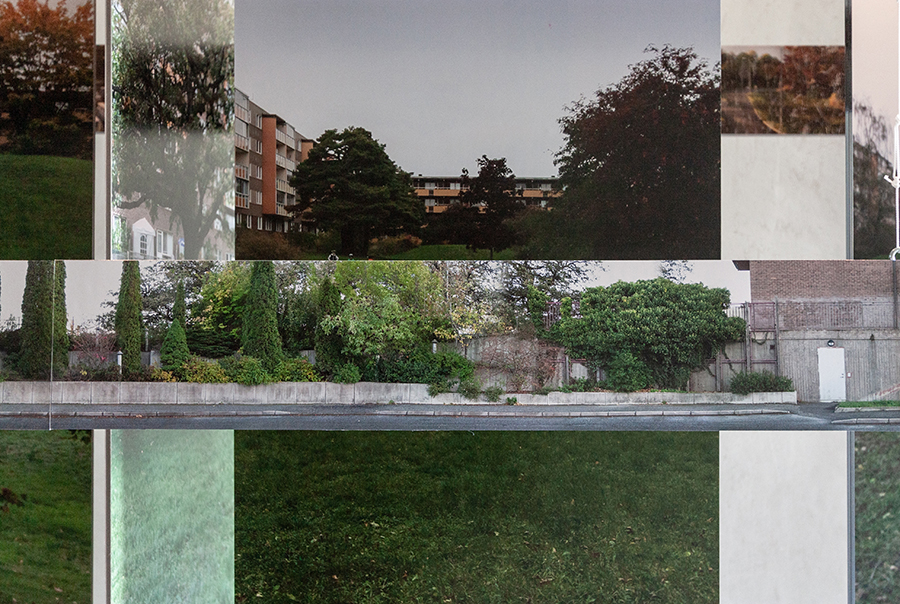
Your phone emits a bleep. The vision fades. You inhale sharply. Pretending to be “modern man” in your head is a favorite game, but it’s hard to it keep up for more than a few minutes, with the twenty-first century gnawing at you through its persistent notifications. It’s particularly hard right this second, given an increasingly pressing need to haul ass to the station and get yourself to another meeting about another project, a project you need to get if you’re going to have any chance of paying your rent this month. In a cruel twist, today’s labor market demands more punctuality and precision of its precariat than any gainfully employed modernist Swedish office worker ever managed. You jog the rest of the way to the station, glancing back at the neighborhood of Fisksätra over your shoulder, from the elevated bridge over the asphalted carpark. Your eyes settle on the wall upon which the whole thing sits: a familiar, rough, concrete surface, penetrated by entrances to garages you’ve never visited. Having a car in this city, on your salary, is laughable. From this angle, you are locked out of your earlier daydream. What should have been a front side, when viewed from the outside, looks more like the rear (a backstage, a loading dock, a quay for oil tankers); the real front is up there on the plinth, in the experience of being inside and above the wall, looking out. In the dream of a break. A cut. Home / Work. Someone, sometime, wanted to make a new world up here. It is, however, no longer new, and you feel torn about it. Good Architecture / Bad Area; Bad Architecture / Good Area: the terms jostle. You have no frame of reference. You have a train to catch.
ONE BIG HOUSE
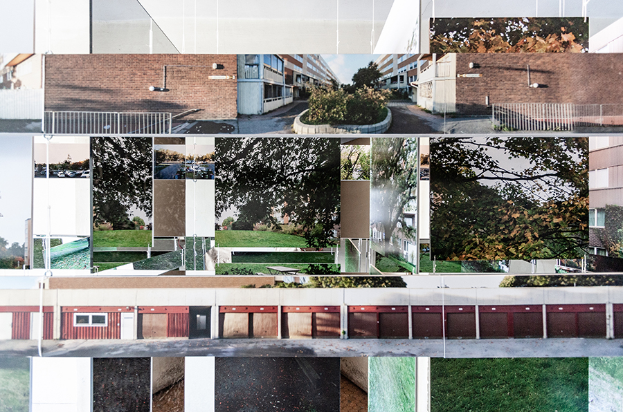
The neighbourhood of Fisksätra is located in the muni- cipality of Nacka, in Stockholm, Sweden, on the edge of the Baltic Sea. Designed by architects Tore Forsman, Ulf Snellman, and Kjell Rosenberg, the area was built between 1971 and 1974 and is home to approximately 8,000 inhabitants. Like many of its Million Program counterparts (the name given to the Swedish Government’s 10-year push, between 1965 and 1974, to build a million housing units), the area is today popularly associated with multi- culturalism and socio-economic segregation. Far-right forces within the municipality have targeted the area in their attempts to pursue an anti-immigration agenda through a critique of urban form. Apartments are rental in tenure, and are relatively difficult to obtain contracts for, due to the city-wide housing crisis and the attractive nature of their large modernist floor plans and relative affordability. Fisksätra offers up a series of brilliant design moves that are seldom discussed in the popular media or in the architectural discourse. By staggering the block structure, the architects denied the traditional city grid in favor of shorter, more complex, view lines. By concentrating commercial functions to a secondary axis, they prioritized the social functions of the primary east-west axis. By allowing consistency and exploiting repetition in the residential architecture, they foregrounded the wild idiosyncrasies of the courtyard gardens which the housing frames. Most important, the area constitutes “one big house,” a built structure that houses thousands in one interconnected whole. It is the plinth that achieves this final move, inducing a tension between separation and extension, which makes the raised world of the courtyard gardens both potentially infinite and highly specific. The treatment of this raised platform draws a stark vertical line, in architectural terms, between the flows of a world of unending work and a world that is both domestic and shared. Earth and rock penetrate the space framed by the two concrete walls on the northern and southern boundaries of the area, making for a plinth that is a porous mix of house and ground.
WITHDRAWAL SYMPTOMS
To see, or talk about, “good” architecture in places where social prosperity is not immediately evident is to enter fraught territory. Despite the fact that seeing architectural failure in the face of a presumed social failure is de rigueur in Sweden today, to refuse to see failure is to risk breaching a silent disciplinary ethics. You might board the train feeling ashamed after our discussion about the Modern Man game. But don’t be. You were, in your feminine body, in these times of constant distraction, unable to render a passable imitation of the figure of the modern architect in any case (you were not tall enough, not old enough, and not absolute enough). This knowledge will make it easier to reject the game in advance. “You can’t have it, but don’t worry, you wouldn’t want it anyway,” we are told about the gaze of the modern architect and his tools. This trick should be familiar from childhood, though, it’s been used by parents to deny children’s requests for ice-cream just as often as it’s been used on feminists to prevent any accidental imagined solidarities with sworn enemies like the modernist architects of the early 1970s. The safest response to this situation—with your body, at this time, in your line of work—has, for some decades now to withdraw (to other practices, other disciplines, and other places). This has resulted in an imperative to engage with discourse instead of form, or to blur the edges of your practice until they bleed into other, less sharp, disciplinary realms. You are expected to engage with the social, to create platforms, to capture histories, or to map life unfolding. Drawing without precision can be easier than wielding a hated weapon; talking helps. Alternately, you are told that you must break with modernism altogether — “stifled” by the weight of our modern predecessors, the old myth goes, Swedish architecture is stagnating, a machine that continues to make “homogenous boxes” that no one likes. Best to withdraw, the voices of un-critique whisper. Against the backdrop of the enforced withdrawal of access (to a job, to a home, to time, to solidarity) that comes with neoliberal precarity, any further withdrawals on architecture’s side (withdrawals to the “craft,” the “countryside,” or to anodyne virtual worlds beyond all of this) seem—for our generation, so saturated with withdrawals—like ineffectual evasion. There is so much work yet to be done. Given this, the men in suits should not be left to play with their plinths in peace…
NAMASTE
“Suddenly,” Pier Vittorio Aureli recounts, “and for a brief moment, one is estranged from the flows and organizational patterns that animate the city, yet still confronting them.” In standing on one of Mies’s plinths—that of the Seagram Building in New York, or the Toronto-Dominion Center—the architect recounts a confrontation with one of “the most intense manifestations of the political” possible in the contemporary city. In a similar way to Michel de Certeau’s near ecstatic ruminations on the city of New York when viewed from the top of the World Trade Center, one can understand the sense of calm purpose that comes with being slightly higher and at a slight remove from everyone and everything else. Away from the mess of it all. Sculptor Antony Gormley has a slightly different relationship to the plinth. In the experiment Still Standing (2011-2012), Gormley introduced a false floor to the galleries of the Hermitage in Saint Petersburg, raising its visitors to a level approximating the plinths upon which the Classical statues normally stood. In One and Other (2009), he placed 2,400 people on the fourth plinth in London’s Trafalgar Square over 100 days, elevating them and refashioning the plinth as a “common ground,” a move that is repeated in Horizon Field Hamburg (2015), where a traversable mirrored surface was hung 7 meters above the floor. Gormley describes his interest as being one of democratizing a horizontal plane, whilst revealing the abstract nature of a “ground.” Here, again, a political intensity is invested in the plinth, although it is not its separation that is celebrated, but its ability to create equivalences and relations. Whilst Gormley’s descriptions of his own work sit easily alongside a dialogue on “mindfulness,” a spiritual orientation that runs throughout his work, Aureli is less keen to talk about the meditative or spiritual nature of “the absolute” that he seeks in Mies. In ways that recall a 5mm-high platform of a yoga mat, both of these opposing views offer up the plinth as a technology for accessing a more contemplative state: in the sculptor’s case, one driven by a collective experience of space, in the architect’s case, one that resulting from taking a break from the managerial flows of contemporary capitalism, but also perhaps to some extent those of everyday life too. If the Seagram Building’s plinth is a yoga mat that keeps the stress of metropolitan life at bay, the plinth upon which Stockholm’s Fisksätra sits does something slightly different. What Fisksätra provides on its plinth is a space where life can be a little bit messier, jobs a little more irregular, where missing a train might not mean missing a mortgage payment, and where in time the activities of one’s apartment might spill out onto the curvaceous hills of the courtyard gardens at any moment. Fisksätra’s plinth has mounds of dirt baked into it; it isn’t even sealed on all four sides (only two, in fact). To acknowledge this formal possibility, rendered real through large-scale mass production and an architecture that pulls its punches in its gardens as much as its facades, is not to romanticize it. It is to understand that such places are needed if all of us are to be able to breathe.
